The 36 Days of Type project is a global creative challenge that invites designers, illustrators, and graphic artists to express their unique interpretation of letters and numbers. Spanning 36 consecutive days, participants are encouraged to design a letter
or number each day, following the sequence of the English alphabet (26 letters) and the numerals 0-9. This initiative fosters a vibrant community of creatives, showcasing a diverse range of styles, mediums, and concepts. From digital art and typography to
3D designs and beyond, the 36 Days of Type project celebrates the endless possibilities of visual design and typography.
A passion for flowers and patterns naturally inspired the foundation of the project.
As a meticulous planner, the initial phase involved mapping out the project, starting
with the selection of flowers to illustrate. Each flower corresponds to a letter of the alphabet, allowing for future applications such as creating a garden center poster
or calendar.
As a meticulous planner, the initial phase involved mapping out the project, starting
with the selection of flowers to illustrate. Each flower corresponds to a letter of the alphabet, allowing for future applications such as creating a garden center poster
or calendar.
Various garden centers and botanical gardens in Brisbane and the Gold Coast were visited to capture direct reference images for the project. For flowers that were not found, copyright-free images from online sources were used as references for painting in Procreate. Photographs of flowers were edited in Photoshop to remove backgrounds, making it easier to image trace in Illustrator. This process facilitated the seamless integration of traced images with the adapted font.


Procreate screenshot of process
Extensive experimentation was conducted with background colours, pattern variations, and the inclusion of both lowercase and uppercase letters.
Final letters A-O
Final letters P-Z
Final numbers 0-9
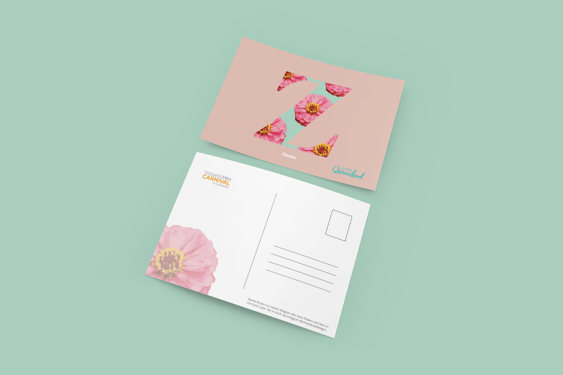
With the completion of the letters and numbers, the next step was to create relevant mock-ups. Every year, the Toowoomba Carnival of Flowers is held a few hours away, making it an ideal context for the project. A postcard featuring the letters along with appropriate Carnival and Tourism branding was deemed a suitable fit.
Toowoomba carnival of flowers logo

Rough sketch for postcard idea

Queensland tourism logo

Ten designs were chosen to become postcard mock ups.
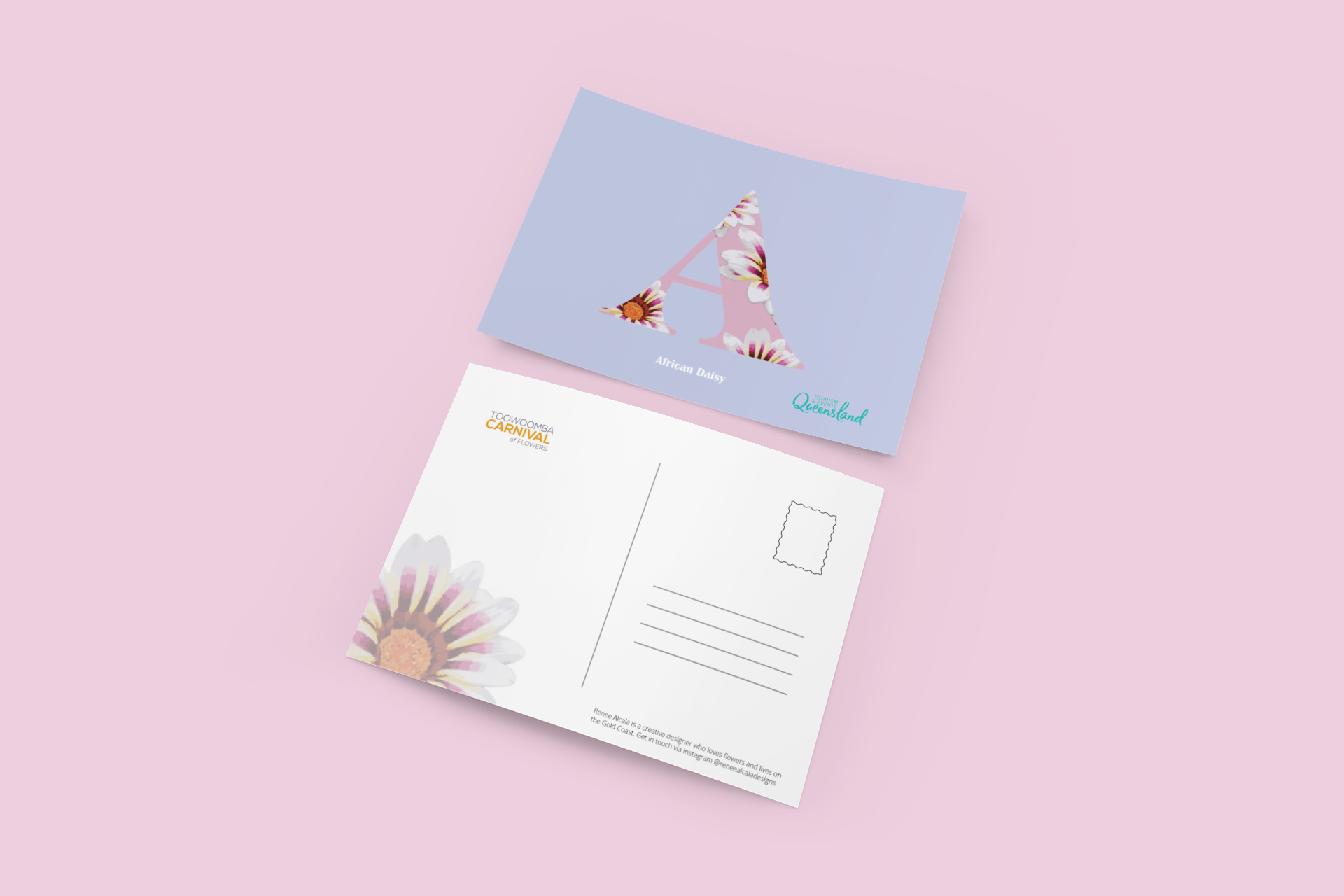
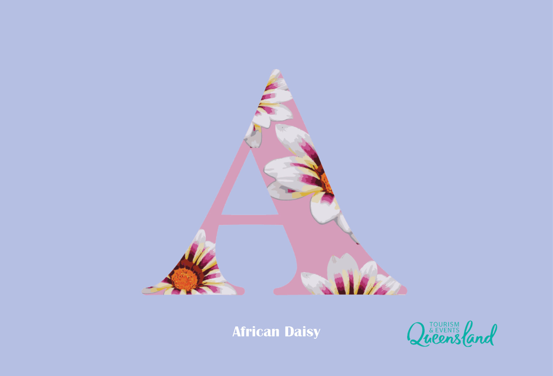
African daisy
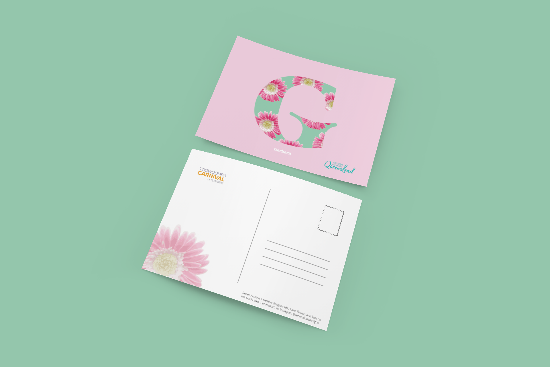
Gerbera
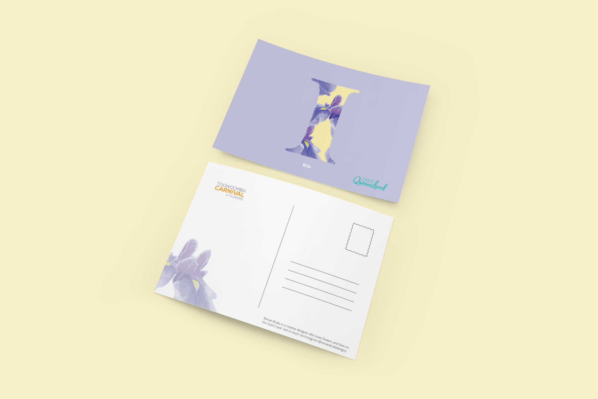
Iris

Nymphea
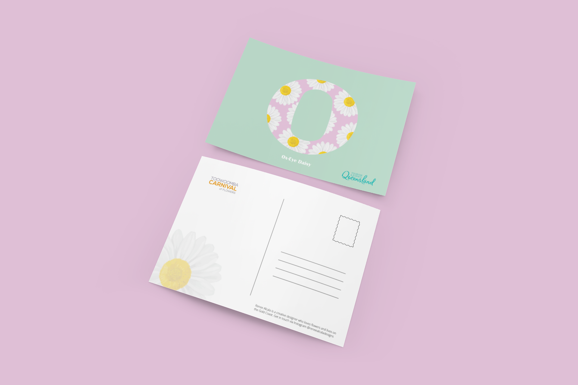
Ox eye daisy
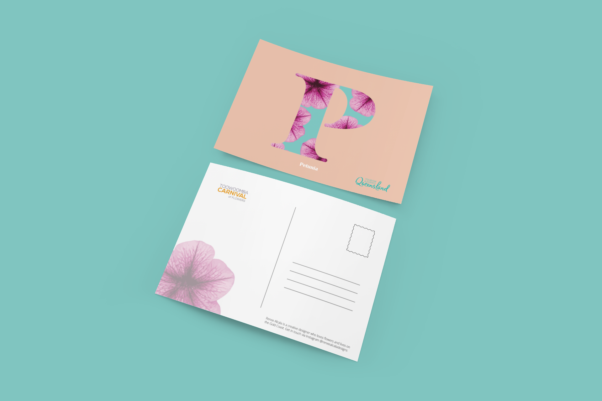
Petunia
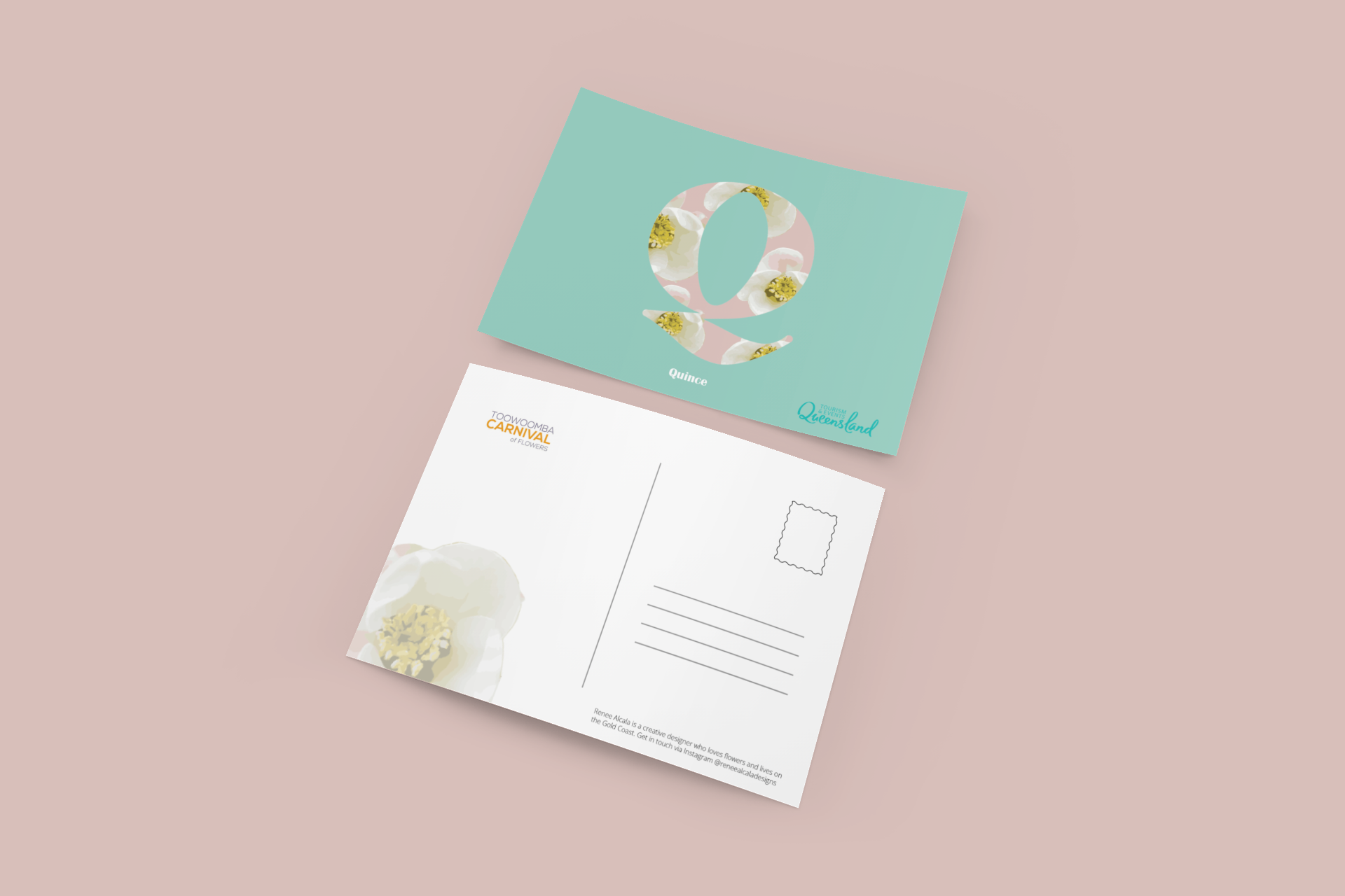
Quince
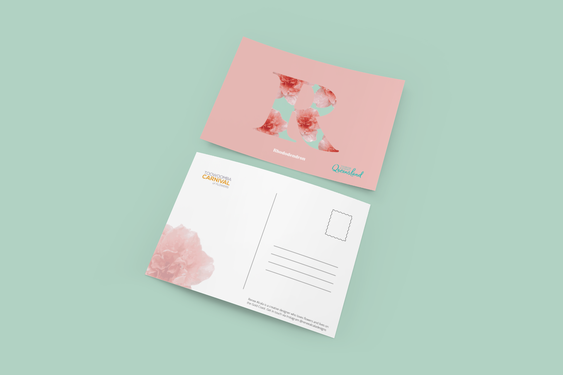
Rhododendron
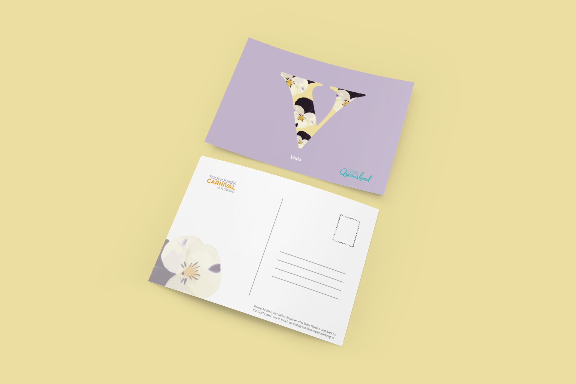
Viola
